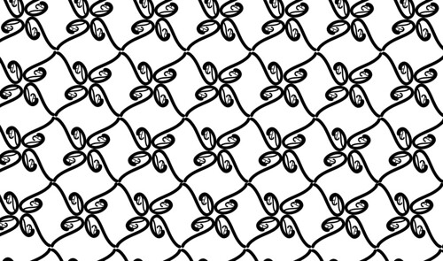
This was the second pattern that I worked on and I wanted the next pattern to feel more organic, a little more 'flowy'. I wanted a 'q' and in the font "giddyup" it was a simple but not boxy font. I feel like this one is a pretty simple design that you might see on a wall paper in someone's dining room or something. I honestly wasn't all that excited about this one but this one seems to be one of the most well received.
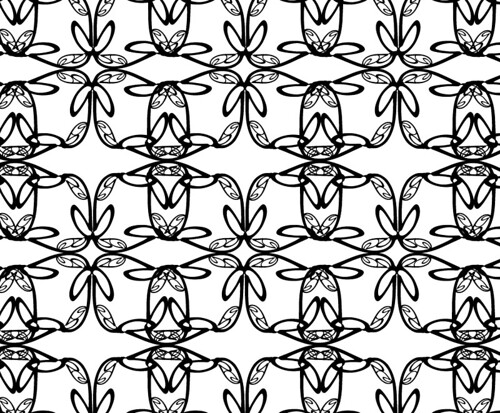
This pattern is probably my favorite pattern of all 4 that I did. I started with a fairly simple pattern of 4 big lower-case g's in a circle. I flipped the image, copied it, mirrored it and pasted it in to make a little bit more complex pattern. I almost want to see what it looks like if I were to shrink down the base pattern and make it more condensed and possibly put some color in it.
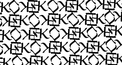
This was the last pattern that I worked on. I really was just kinda playing around with the letter M and wanted to see what I could do by doubling one M over the top of another. At this point, I was really enjoying reflecting/mirroring images. This one is fun, but is kinda hard to look at.
No comments:
Post a Comment