Wednesday, April 29, 2009

Unspoken Rules of Design

Just because right now it seems like everything I do with my designs is terrible, it felt appropriate to post this. Anway...


1. Your fonts will default to the worst possible font available on the machine you are showing your work on.

2. If you have two versions of a photo, the wrong one will make its way to the printer.

3. The less time you have the more useless your computer will become.

4. Promises made by the sales staff have no basis in reality.

5. The sales staff will promise anything.

6. If the text consists of two words, one will be misspelled.

7. Speed. Quality. Affordability. Pick any two.

8. If the run is wrong, it's never the press operator's fault.

9. Spell checkers don't.

10. Grammar checkers don't, either.

11. Proof raeders are useless.

12. Global search-and-replaces aren't.

13. The index entry you leave out will be the first one the client looks under.

14. Optical Character Recognition (OCR) is good comedy.

15. If three designs are shown to a client, your least favorite will be chosen or any combination of worst components of each.

16. If two designs are shown, a third will be requested. If provided, then one of the first two will be chosen.

17. If you ask for more copy it will be sent as a .jpg. If you ask for images they will send powerpoint presentations.

18. Clients don't have their company logo in a usable print ready format so don't bother asking.

19. Blue line proofs reveal previously invisible errors.

20. The best designs never survive contact with the client.

21. You will misspell the name of the client's spouse.

22. Your best idea is already copyrighted.

23. The best way to find errors in your code is to show a client "a new feature".

24. There is no stock photo ever made that matches the image you have in your head.

25. Creative inspiration flows in inverse proportion to the distance from the studio.

26. Time allowed to complete work is inversely proportional to time taken by client to work out what to complain about.

27. Doctors, astronauts, and plumbers need training to do their jobs, but anyone with a computer is a graphic designer.

28. No matter how detailed the tech support FAQ is, nobody has ever heard of your problem.

29. The number of colors in a client's design will equal the number of colors in the original bid specs, plus two.

30. The client's disk won't run on your equipment & when it does will contain unusable copyrighted images.

31. If you purchase new equipment to read your client's disk, it will be the last disk of that type you will ever receive.

32. Your client will often not like your design but not quite know why.

33. Computer crashes always happen exactly 30 seconds before saving.

34. A client who knows exactly what he wants is worse than one that has no idea.

35. Clients who do not provide content upfront will complain about the use of Lorem Ipsum.

36. Everything has to be done immediately, deadlines are incredibly important unless client has to provide materials or approve your work.

37. The customer is always right . And an idiot.

something cool I found to help with composing/designing.

http://jakegarn.com/the-rule-of-thirds/

Friday, April 17, 2009

What the f*nt?

I'm starting to get behind on my tutorials... I will be doing that this weekend. PROMISE!!!! It's really hard to do tutorials at work. Oddly it's not too difficult to do search on this kinda stuff....

Buuuuuuut, I have found some really cool websites for fonts. Working on my 118 project, I really wanted a very condensed, light, sans serif looking font type. I looked through all the fonts that were already pre-loaded in Illustrator, but no luck. Tehre was some stuff, but nothing I actually liked and fit with the design I was kinda hoping for. Anyway, with a little help from my mom, I found these awesome sites! A lot of them let you download the font for free. And they have them available in both Mac and PC formats. Sawweeet!

DaFont

What the F*nt??

Type Now

1001 Free Fonts

Wednesday, April 15, 2009

I don't know how many of you guys have really looked at Colour Lovers yet, but I'm seriously so happy to have this resource. I'm working on my 118 project right now, and am really having a hard time figuring out what I want to do for a color scheme. I know that I tend to use colors that I **like** as opposed to thinking of a set of colors taht work well together and are interesting. I'm definitely making a concerted effort to try to stay a little more open minded to colors that aren't necessarily my favorite.

Tuesday, April 14, 2009

You k now what I love?


Perfectly matching, perfectly circular circles.


This edition brought to you by late nights in the Broadway lab and lots of caffeine.


That is all.

Thursday, April 9, 2009

Amy states, “To me, feeling the completion of a piece is like reaching that ethereal finish line, and you feel the way that you do when you see the ocean from the shore, or when you exit a matinee and squint into the sudden light, knowing all along it was there.”


We will never forget the first time Amy Ruppel came into the shop. It was like some famous rock star had come to visit. We were like giddy little school girls! We were even more excited when she agreed to be a Student Of The Month. Amy's work is so well known & loved and rightfully so... Everything she creates is adorable. She is a true professional through & through. It was such a thrill to work with her. Thank you Amy for being such an inspiration! This limited edition print titled "Tree Factory" is printed by our friends at Pinball Publishing on post-consumer recycled paper with soy-based inks. 11x14" signed & numbered. 5% of the proceeds from the print will be donated to Amy's charity of choice: The American Bird Conservancy, www.abcbirds.org

I haven't been buying anything lately...well besides An Awesome Book by Dallas Clayton. I couldn't resist Amy Ruppel's newest bird series based on state birds. I was missing California (a daily occurrence) and decided that I had to have this little quail creation. I emailed Amy and minutes later it was mine. There are still a few states left and the next sale for the second half of the states is Friday. I'm already thinking of investing in New York...

it’s only fitting that today’s first (yup, we have two today!) sneak peek belongs to artist amy ruppel because she was both the original inspiration for the sneak peek column and is my gracious host while i’m in portland this week! i can’t wait to have dinner at her new restaurant (along with her husband randy) cava and check out all of her insider haunts. in the meantime, she’s sharing a little insider sneak peek into her brand new studio space today. full of light and beautiful little vignettes, it’s a great way to see how amy works and what she keeps around her for inspiration. as always you can click here for full sized (and additional) photos of amy’s studio, or click “read more” below to see many more photos after the jump. [thanks to amy for sharing- and for hosting me this week!]
Some images I wanted to stick in here done by Amy Ruppel. <3


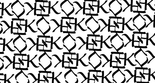
This is the first set of pattern that I did. At first I tried to make the base of it with only 3 K's circled together, however I couldn't make it set evenly when I tried to make them pattern together. I feel like this one is really boxy and have gotten a lot of really mixed feed back. Some people really liked it and saw it in a flowery type of pattern and others saw it as very boxy and restricted.


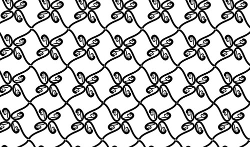
This was the second pattern that I worked on and I wanted the next pattern to feel more organic, a little more 'flowy'. I wanted a 'q' and in the font "giddyup" it was a simple but not boxy font. I feel like this one is a pretty simple design that you might see on a wall paper in someone's dining room or something. I honestly wasn't all that excited about this one but this one seems to be one of the most well received.


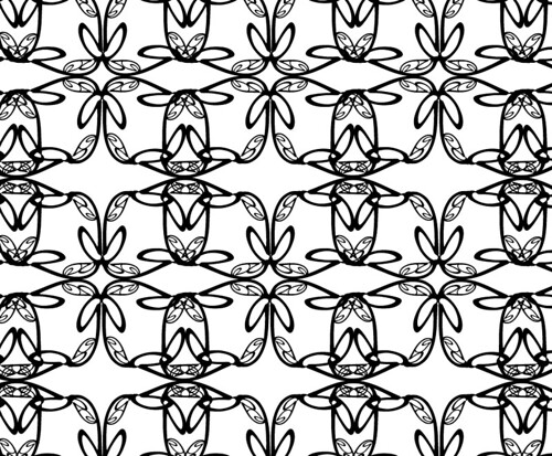
This pattern is probably my favorite pattern of all 4 that I did. I started with a fairly simple pattern of 4 big lower-case g's in a circle. I flipped the image, copied it, mirrored it and pasted it in to make a little bit more complex pattern. I almost want to see what it looks like if I were to shrink down the base pattern and make it more condensed and possibly put some color in it.


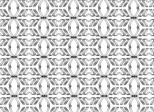
This was the last pattern that I worked on. I really was just kinda playing around with the letter M and wanted to see what I could do by doubling one M over the top of another. At this point, I was really enjoying reflecting/mirroring images. This one is fun, but is kinda hard to look at.

Friday, April 3, 2009

wow... incredibly random short animated video. check it out: http://www.albinoblacksheep.com/flash/figurine
In my 'stumbling' I actually came across a tutorial page for photoshop and it has some really awesome images on it. This one was really cute:


this one was really interesting to me to incorporate yoga with the image of a woman and the idea of her being like a rubber band:


this one is little blurry but I like the concept:


The next two images are really awesome to me. I really like the high color contrast in them and the bright colors. This is the kind of stuff that I'd like to be able to create myself:


here's the link to the page I found all the images: http://psd.tutsplus.com/articles/web/40-brilliantly-photoshopped-print-ads/
A lot of times I use stumbleupon.com when I'm bored. I have it set up so my preferences will bring up pages that I will more than likely enjoy. I came across this image today that I liked, and happened to be someone's blog. (person I don't know) But here is the image:


the link to the page (although may not be terribly helpful) http://mpyressflamearts.blogspot.com/

Thursday, April 2, 2009

I was looking through some of the images on the AIGA website, and found some really cool stuff. Unfortunately because of the copyrights on them, I couldn't save them. However, this one is really interesting to me. I like the way the text is used as an object, and not just simple text. Lookie lookie

Wednesday, April 1, 2009


This tutorial talked about paths. At first the paths have no appearance, as shown in the first image. They are simply paths. The second image shows that you can use "fills" and "strokes" to add meaning to these images. The rectangle has been filled with yellow and, the stroke tool was used to give it an outline. You can dictate the thickness and/or color of the outline; you can also change the color or the pattern of the fill in the shape. As well as making the outline thinner or thicker, you can control whether there are gaps in the line. You can determine the length of each gap as well as each dash.

This tutorial was on the page: http://www.lynda.com/home/DisplayCourse.aspx?lpk2=351 >>> link: Fill and Stroke Attributes

This tutorial explained how a line in Illustrator is defined by two anchor points, shown in the upper left image. If you were to use control handles that extend off from anchor points, they will control how the curves are drawn from point to point. You can see this exampled in both the images on the right. In the top right side image, the anchor points are the same as the anchor points as the line on the left, but the control handles dictate taht the line is not straight from one point to the other.

this is from the tutorial page http://www.lynda.com/home/DisplayCourse.aspx?lpk2=351 >>> "understanding paths" link

screen shot... tutorial on vectors


Watching this tutorial was pretty helpful for me to be able to understand the difference between Illustrator and Photoshop. I've only ever used photoshop before, but it's awesome to be able to see how Illustrator has such better detail. It's always been pretty frustrating trying to deal with pixels in PS.

http://www.lynda.com/home/DisplayCourse.aspx?lpk2=351 >>> vectors link

blog assignment #1

computer experience: I am nearly exclusively a mac user. I have used them for 15 years, however my knowledge with them isn't too terribly extensive. I have played a little bit with photoshop, but this class is my first experience with Illustrator. I am pretty familiar with quick keys on macs and very comfortable using them. I have also used PC's for a little bit of image editing and also for work purposes.

what are you excited about? I'm very excited about this term and getting a chance to really get to know Illustrator. I just started back in school in the fall with the graphic design program and couldn't be more ecstatic. Once I finish the program, I'm stoked about being able to incorporate art into my work and everyday life.

favorite books & magazines: As far as books go, I am a pretty big sci-fi geek. I love to read Orson Scott Card books. I also like to read some of Jacqueline Carey's stuff. That being said, I tend to have a wide range in reading-tastes. In all reality, if a friend tells me it's a good book, almost regardless of the genre, I'll probably read it. Although I don't really read magazines all that much. I just really haven't ever gotten into them.

favorite websites: Lately I've spent a lot of time reading some webcomics like xkcd.com and cyanide and happiness. One of the more hilarious (and pointless) sites that I often read is www.fmylife.com. I keep an active personal blog that I also use to keep up on friends and local happenings; I tend to spend a lot of my online-time there.